BULLETT:
PRINT, 3D, UI/UX, DIGITAL
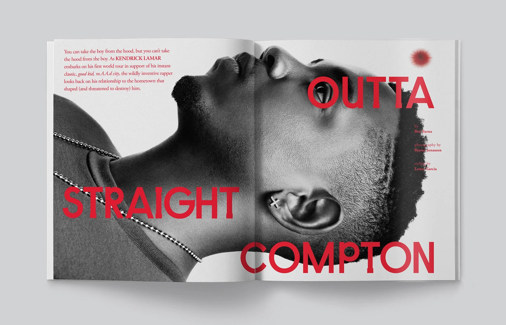
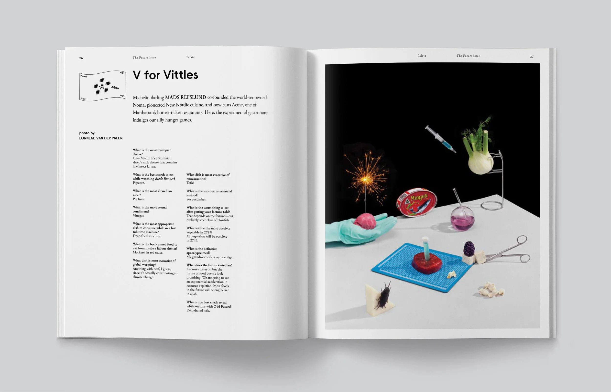
A downtown NYC institution, Bullett Magazine was a stepping stone. We were lucky enough to help shape its visual identity through graphic design, art direction, and emerging 3D for both print and digital. Known for its fearless blend of fashion, art, and culture, Bullett thrived on pushing boundaries—and we made sure every page, pixel, and render did just that. From high-gloss editorials to interactive digital spreads, we crafted a universe where storytelling met striking aesthetics, leaving an indelible mark on the intersection of style and subculture.

Bullett Magazine wasn’t just another glossy—it was a cultural manifesto, and we made sure every page amplified that message. From bold layouts to meticulous type setting, our graphic design work helped shape the magazine’s unmistakable aesthetic. We were very lucky to collaborate with an insanely talented team. Every spread was a statement, every element meticulously crafted to cement Bullett’s status as a genre-defining publication.


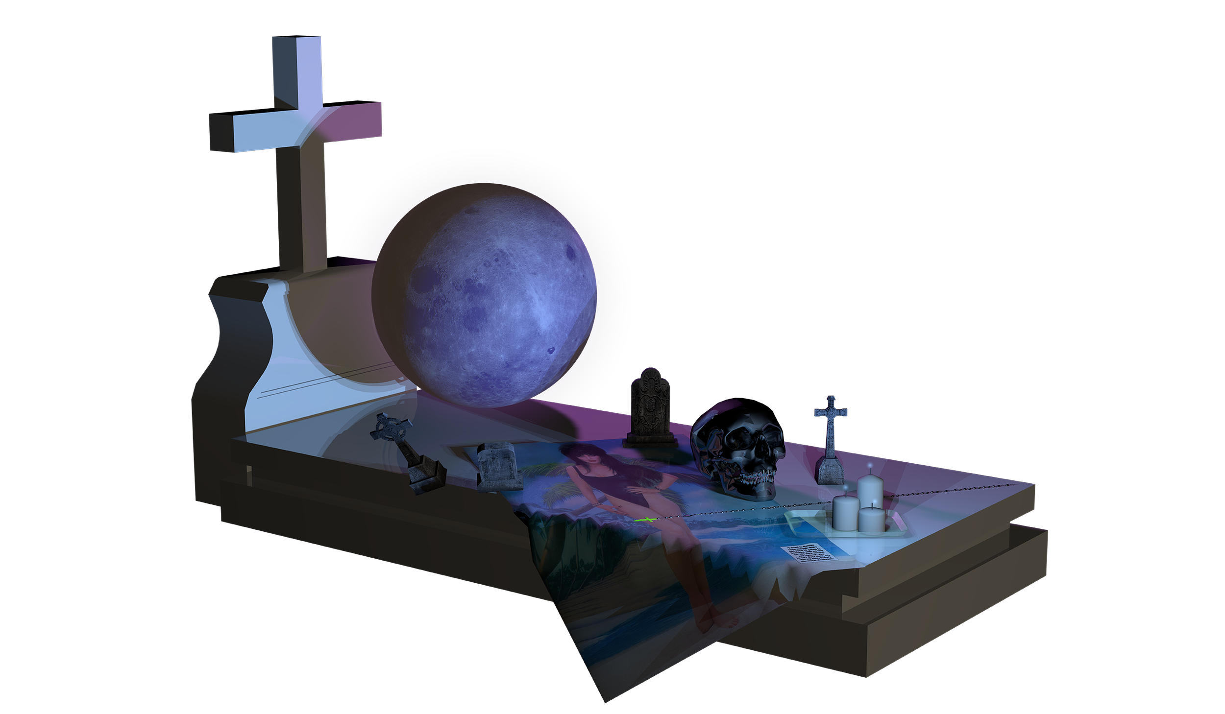
Long before “UI/UX” entered everyday vocabulary, we were designing interactive layouts, gesture-driven navigation, and spatial reading experiences that blurred the line between editorial design and product design. Pages behaved more like interfaces, typography functioned as navigation, and motion was treated as structure rather than decoration. We also pushed into early 3D environments and layered compositions, building depth and dimensionality directly into the editorial experience. What started as a digital publication quietly became a prototype for app thinking — part magazine, part interface, and unintentionally, a preview of where digital design was heading.